
Morten A. Giraffe

Journal / UI UX Field Guide

A Good-Looking Website Is Not Enough: 18 UI/UX Rules That Make It Work

A website can look expensive and still make the visitor work too hard. Useful design makes the offer, proof, interface, and next step easier to understand.

Design is not decoration. It is how the offer, interface, and next step become clear.

00How To Use It

Start with the job of the page.

Do not try to apply all 18 rules to every screen. Identify the person, their context, the decision in front of them, and the next useful action. Then use the relevant rules to find friction.

Each rule below keeps the same working shape: definition, why it matters, failure mode, applied correction, and a practical test. That structure makes the guide useful for designers, founders, developers, and teams reviewing a launch.

01Quick Audit

Twelve questions before another animation.

If several answers are no, the path needs clearer structure before it needs more visual effects.

  1. Can a new visitor name the page purpose after five seconds?
  2. Is one idea visually dominant?
  3. Do spacing and grouping communicate relationships?
  4. Are interactive elements recognizable, reachable, and large enough?
  5. Are choices structured instead of multiplied?
  6. Is necessary context visible instead of dependent on memory?
  7. Does every action receive immediate, meaningful feedback?
  8. Can people recover without losing work?
  9. Does the page work with keyboard, zoom, reduced motion, and assistive technology?
  10. Does mobile preserve the task rather than squeeze the desktop layout?
  11. Is proof placed beside the doubt it answers?
  12. Are success measures tied to user and business outcomes?
03Story Series

Go deeper on one rule at a time.

The full guide stays here. Each chapter page adds a cold open, failure path, rebuild pattern, role guidance, field test, FAQ, and source trail.

Rule 01

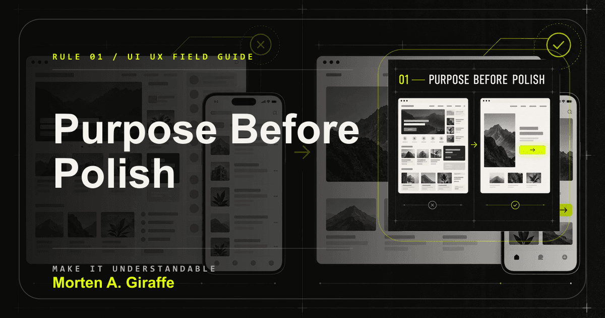
01. Purpose before polish

Every page needs one clear job before it needs another layer of visual treatment.
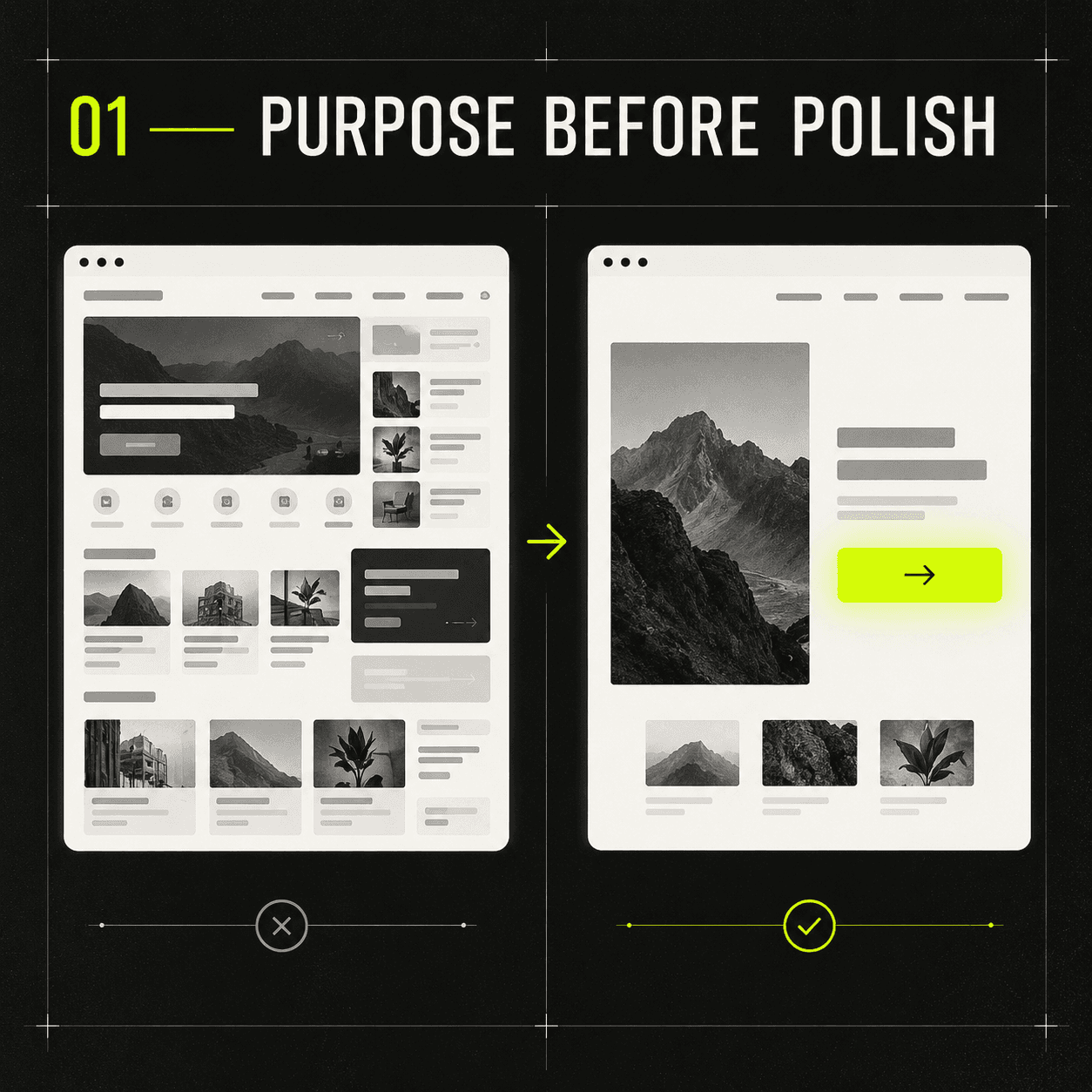
A cluttered interface contrasted with a focused interface built around one clear action.
The useful version spends visual force on the action the page exists to create.

Why it matters

A page works when the right visitor can tell where they are, why it matters, what proves it, and what to do next. Without that job, sections compete for attention and polish hides the real strategy problem.

Failure mode

The screen opens with company-centered copy, equal-weight CTAs, decorative visuals, and no obvious decision path.

Applied correction

Write the page job in one sentence: this page helps this person understand this thing and take this next step. Then cut, reorder, or reduce anything that does not support that sentence.

Practical test

Show the page for five seconds. If people cannot name the offer and next action consistently, the page needs structure before more polish.
Rule 02

02. Visual hierarchy

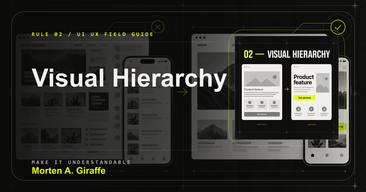
Hierarchy is the order in which a page asks to be read, scanned, trusted, and acted on.

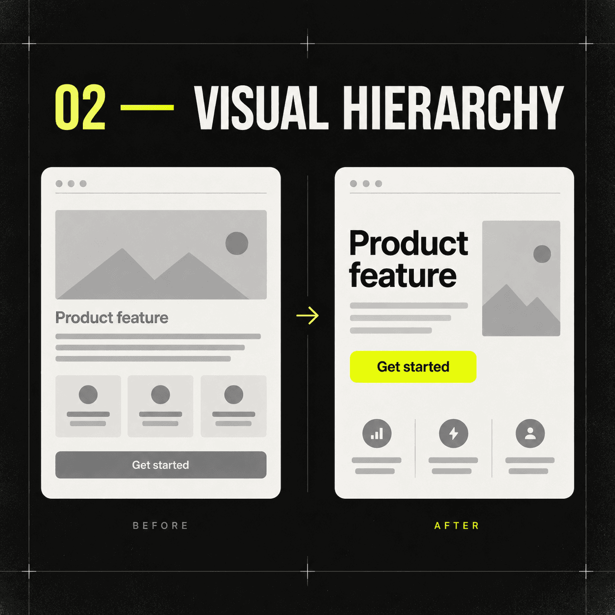
Flat visual emphasis contrasted with a clear headline, supporting content, and dominant action.
Hierarchy turns scanning into orientation instead of guesswork.

Why it matters

Scale, position, spacing, weight, contrast, motion, and restraint should agree with the visitor decision order. When everything is loud, the visitor has to build the priority system by themselves.

Failure mode

The most visually dominant element is an illustration, metric, carousel, or label that does not help the visitor make the next decision.

Applied correction

Give the page one dominant idea, a few supporting facts, and one action whose weight matches its importance. Make headings and button labels tell a coherent story even when body copy is skipped.

Practical test

Audit the page in grayscale and at thumbnail size. The right idea and action should still be obvious.

Rule 03

03. White space

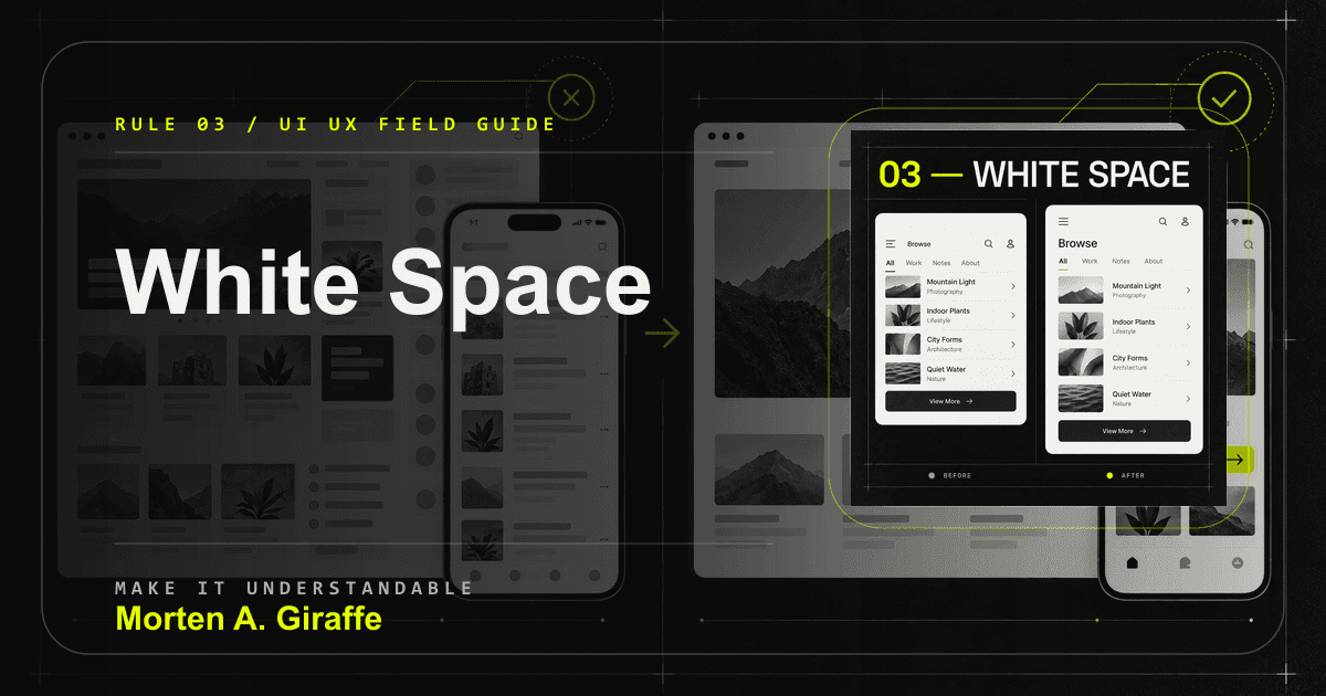
White space is not empty decoration. It is the distance system that shows what belongs together.

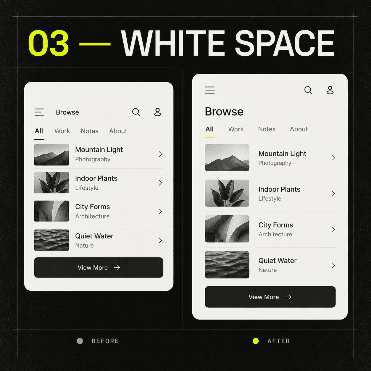
Cramped interface content contrasted with deliberate spacing and readable grouping.
The best space makes relationships visible without adding explanation.

Why it matters

Space separates unrelated ideas, groups related controls, gives important content enough quiet to register, and creates a readable rhythm from section to section.

Failure mode

Desktop spacing becomes endless mobile scroll, or nearby labels, fields, captions, and buttons feel unrelated because gaps are arbitrary.

Applied correction

Use a spacing scale. Keep label and input close, field groups farther apart, and section changes visually distinct. Preserve relationships across breakpoints instead of preserving raw desktop dimensions.

Practical test

Blur your eyes or zoom out. You should still see meaningful clusters before reading the words.

Rule 04

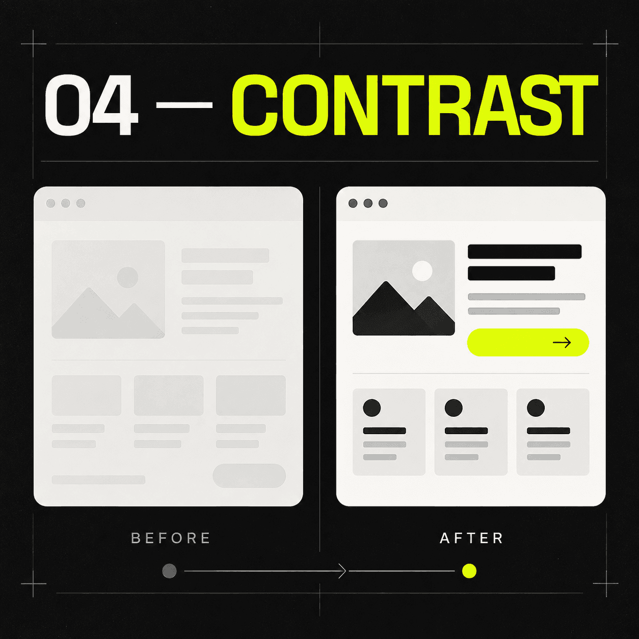
04. Contrast

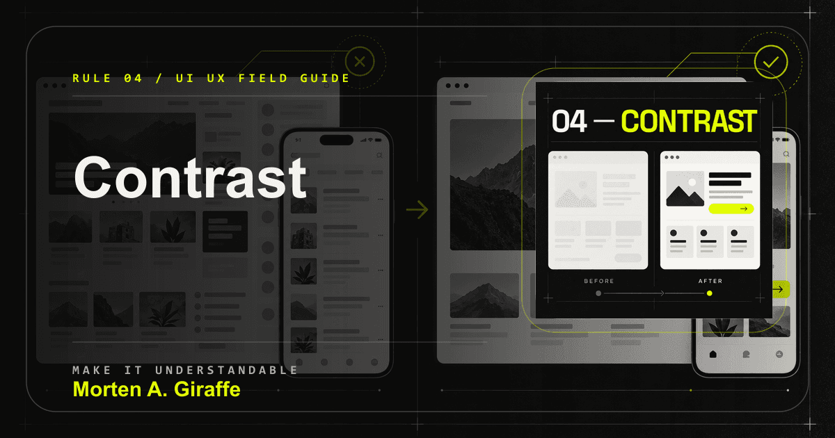
Contrast makes differences legible: foreground and background, primary and secondary, interactive and static, available and unavailable.

Low-contrast content contrasted with a clear legible interface and visible primary action.
Contrast should help people separate meaning, not merely create drama.

Why it matters

Color contrast is only the start. If the same accent marks everything, it stops meaning anything. If a link is shown only by color, some visitors will miss it.

Failure mode

Disabled controls look active, secondary labels fade below readable contrast, and every small badge uses the same high-attention color as the primary CTA.

Applied correction

Reserve high-contrast treatments for actions, focus, active state, and critical signals. Pair color with shape, position, language, and state. Use WCAG 2.2 as the baseline for contrast-sensitive choices.

Practical test

Check the interface in grayscale, on a phone, in bright light, at zoom, and against the current contrast requirements before trusting your eye.

Standards note: WCAG 2.2 is the accessibility baseline for contrast-sensitive review.

Rule 05

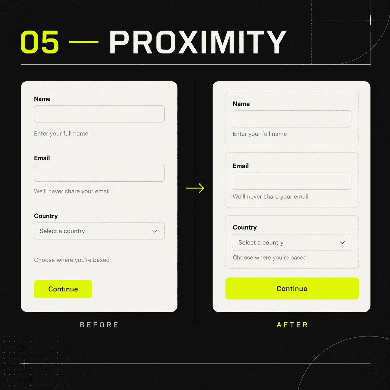
05. Proximity

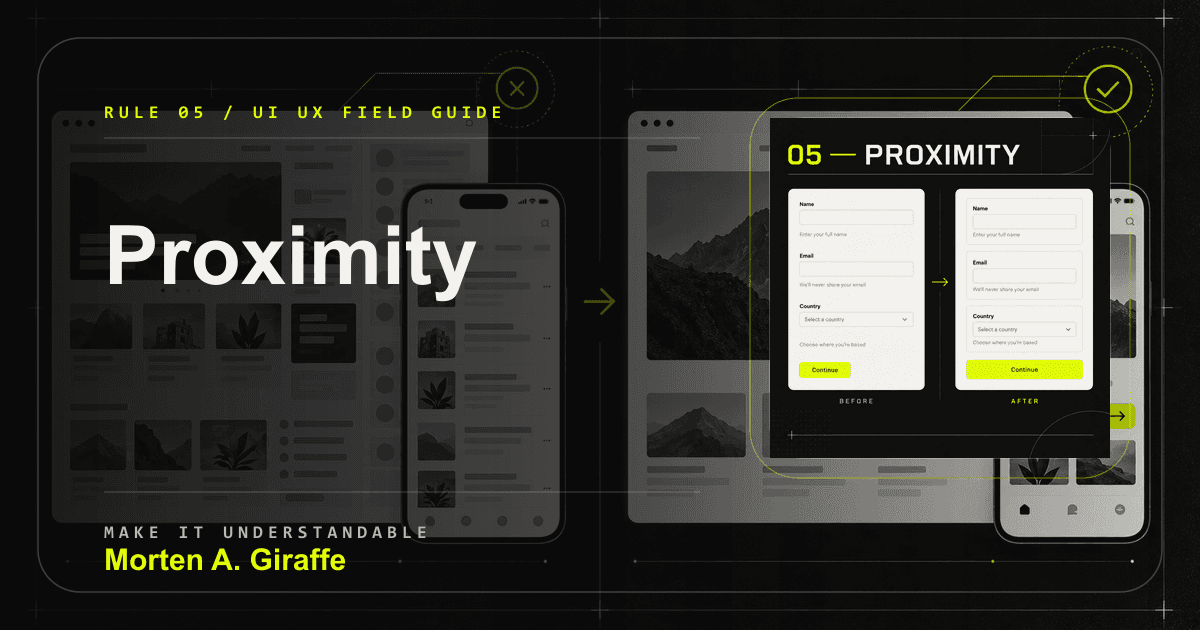
People assume nearby things are related, often before they read a single label.

Ambiguous form spacing contrasted with clearly grouped labels inputs help and actions.
Good grouping removes the question of what controls what.

Why it matters

That assumption makes proximity one of the fastest ways to clarify a form, card, comparison, or action area. It also makes poor spacing expensive.

Failure mode

Help text sits closer to the next field than the one it explains, or a button floats between two cards and appears to act on both.

Applied correction

Group by meaning first: label, control, help text, validation, and field-level action should live in one local unit. Then create a larger gap before the next unit.

Practical test

Ask someone to draw boxes around what belongs together without reading the copy. Their boxes should match the component model.

Rule 06

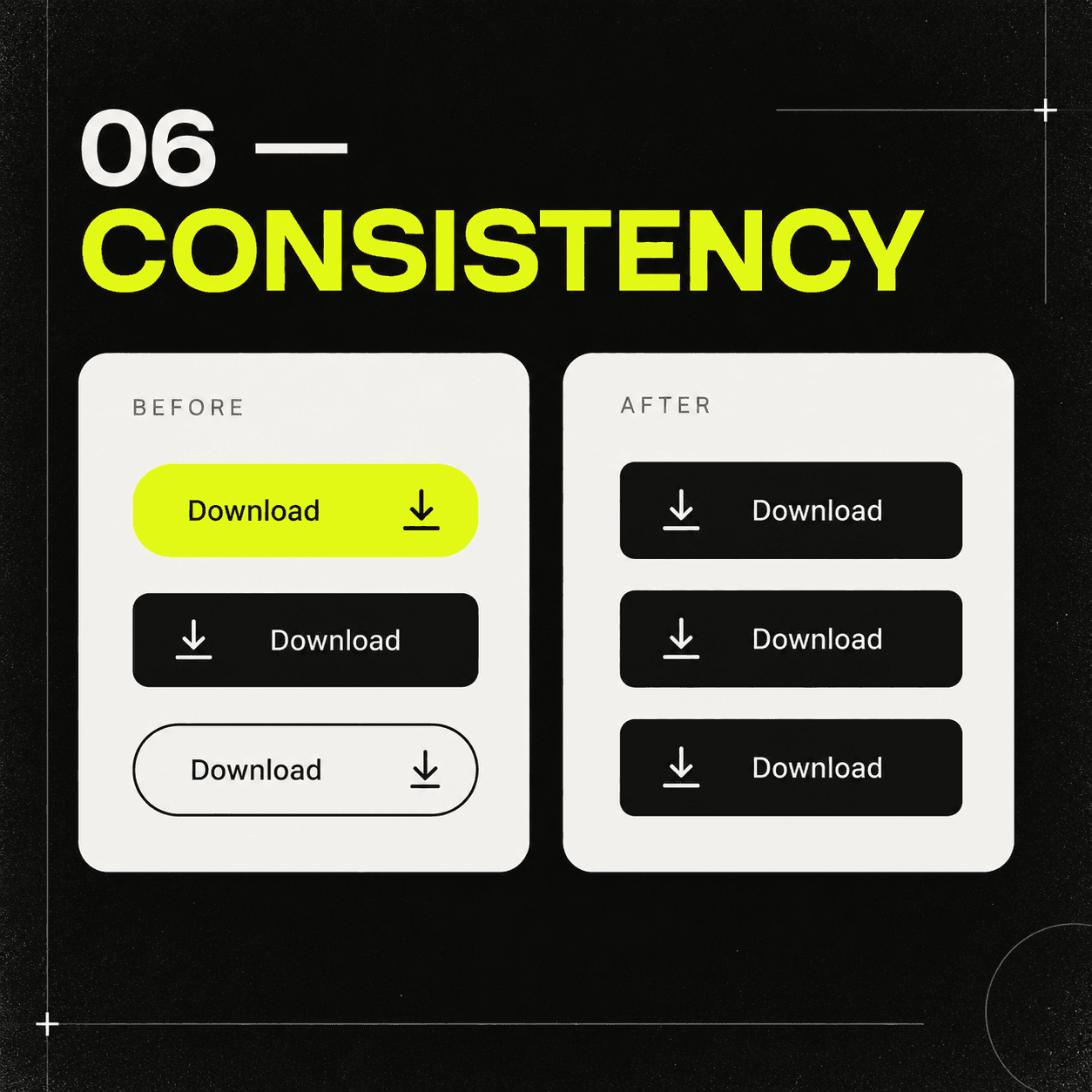
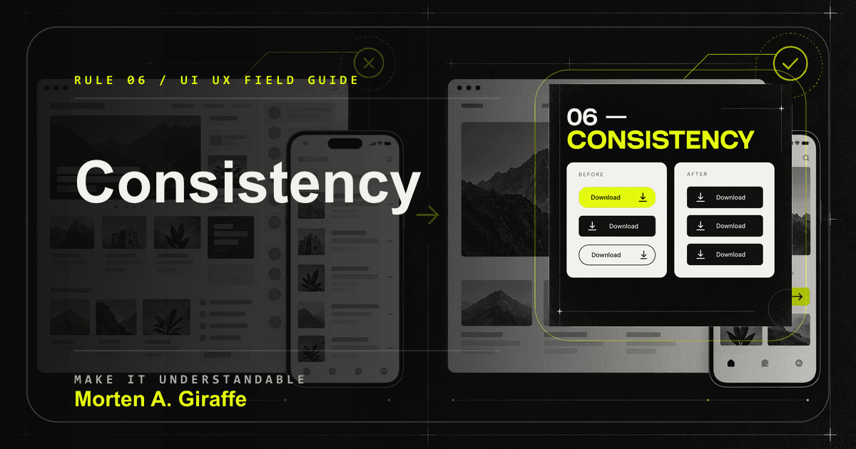
06. Consistency

Consistency lets a visitor use what they already learned on one part of the site in the next part.

Conflicting button styles contrasted with one repeatable component language.
Consistency turns past learning into future speed.

Why it matters

A design system is useful when it preserves tested meaning: primary, secondary, destructive, selected, disabled, loading, and success states should behave predictably.

Failure mode

A lime pill sometimes opens a form, sometimes navigates, sometimes filters, and sometimes marks decoration.

Applied correction

Standardize roles before appearances. Compare repeated actions by label, icon placement, focus state, loading behavior, destination, and confirmation.

Practical test

Audit every repeated action across the site. Similar actions should look and behave similarly; different actions should differ for a reason.

Rule 07

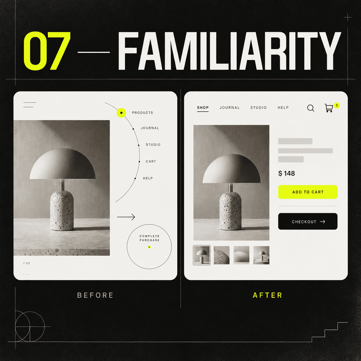
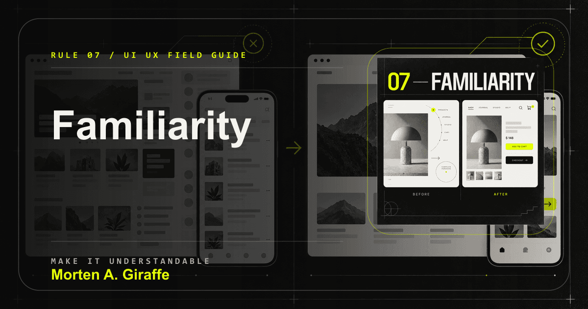
07. Familiarity

Familiar patterns let an interface borrow the visitor experience from every other site they have used.

Experimental commerce navigation contrasted with recognizable product and checkout patterns.
The strange version may be memorable; the useful version is usable first.

Why it matters

Originality belongs in the point of view, composition, voice, and proof. Hiding expected behavior behind novelty makes people learn before they can act.

Failure mode

Navigation behaves like a puzzle, the logo does not return home, links do not look interactive, or a purchase path breaks normal checkout expectations.

Applied correction

Keep the basic behavior recognizable unless the new pattern has a real user benefit and has survived first-use testing.

Practical test

Give the interface to someone who did not see the design presentation. If they need the interaction explained, the interface is not carrying enough of the load.

Rule 08

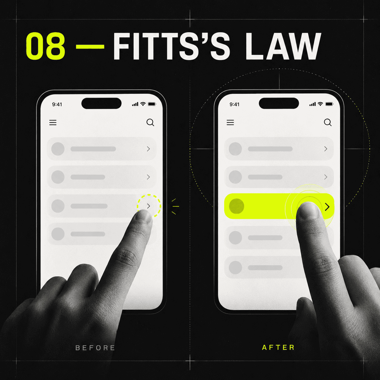
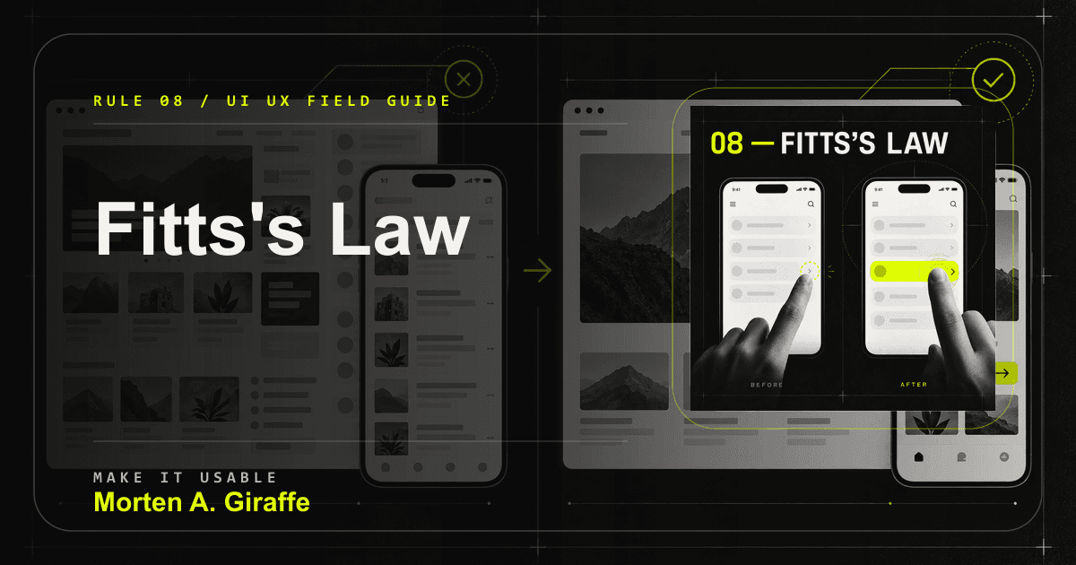
08. Fitts's Law

Targets are easier to acquire when they are large enough and close enough to the point of attention or input.

A tiny mobile target contrasted with a large nearby thumb-friendly action.
The visible icon can be small; the interactive target should not feel tiny.

Why it matters

This matters on touch screens, under time pressure, and for people with limited dexterity. A tiny icon or crowded pair of actions turns a normal movement into precision work.

Failure mode

The primary mobile action is narrow, close to a destructive action, or placed where browser chrome, safe-area insets, or the on-screen keyboard makes it unreliable.

Applied correction

Give controls generous hit areas, keep the next action near the content that enables it, and separate destructive or rare actions from frequent ones.

Practical test

Use the interface with one thumb, keyboard, zoom, and switch-access assumptions. Important controls should remain reachable and distinct.

Standards note: WAI target-size guidance is used here as the minimum pointer-target reference.

Rule 09

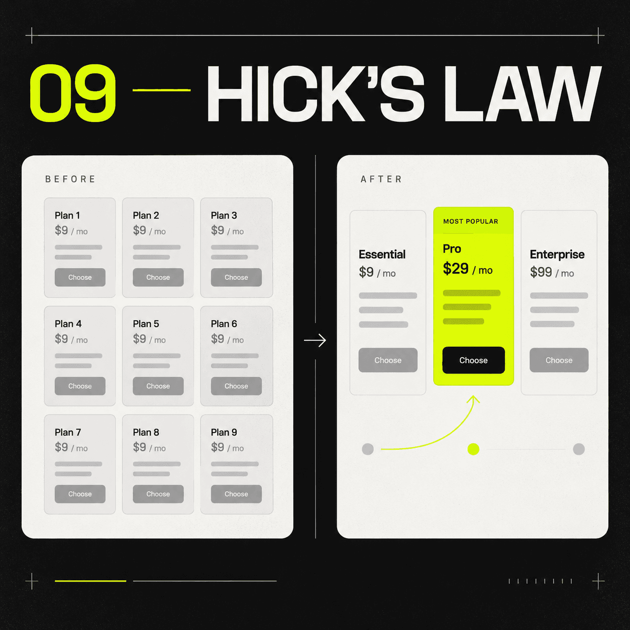
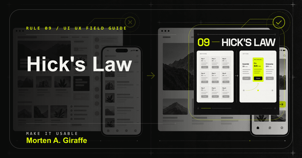
09. Hick's Law

More choices usually require more decision effort, especially when the differences are unclear.

Nine equal pricing choices contrasted with three differentiated paths and one recommended option.
Reducing noise is different from removing meaningful choice.

Why it matters

The fix is not to remove useful choice. The fix is to structure choice so people can compare what matters and ignore what does not.

Failure mode

A visitor sees call, email, subscribe, download, book, browse, and buy with equal visual weight and no clear order.

Applied correction

Lead with the common path, make differences comparable, provide a safe default when truthful, and move rare choices out of the primary decision surface.

Practical test

Measure decision time and confidence. If people choose quickly but cannot explain the difference, they may be guessing.

Rule 10

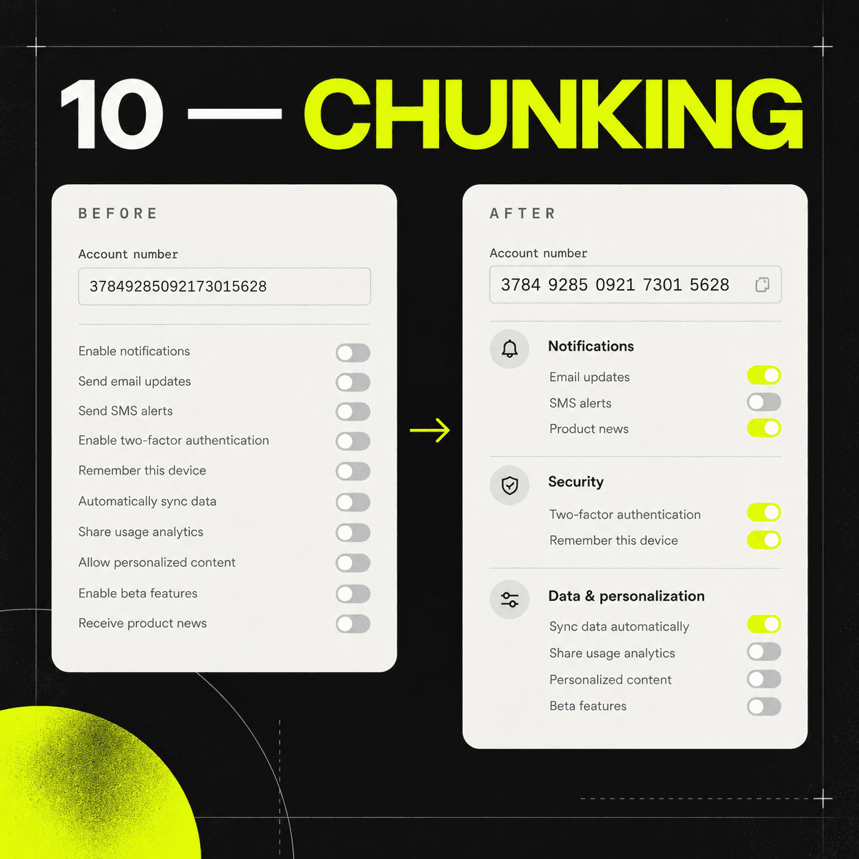
10. Chunking

Chunking groups information into useful units so the visitor does not have to hold the whole page in memory.

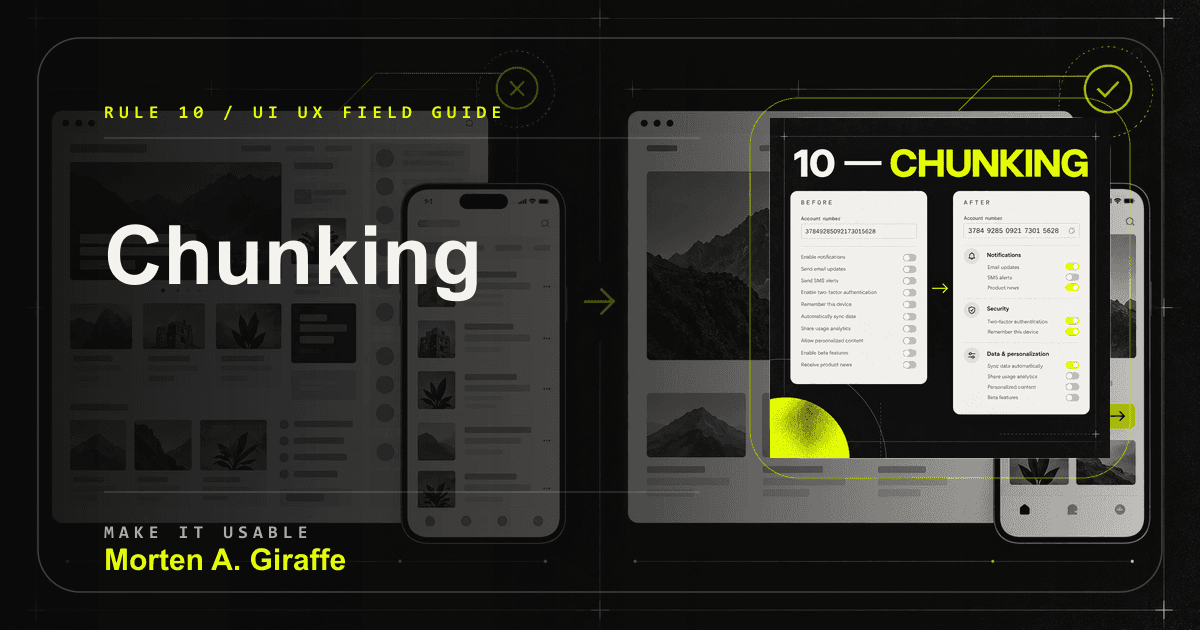
Dense unstructured information contrasted with grouped numbers and labeled setting sections.
A useful chunk has a real label and a real reason to exist.

Why it matters

Interfaces fail when they expect people to remember a page of instructions, several plan differences, and a verification code at the same time.

Failure mode

A dense list gets split into decorative cards without better labels, or the next screen asks for information that disappeared on the previous screen.

Applied correction

Group by task and meaning. Keep needed context visible while decisions are made, and break long numbers or identifiers into readable groups.

Practical test

Use recall only where recall is required. For most flows, recognition and visible context are safer than memory.

Rule 11

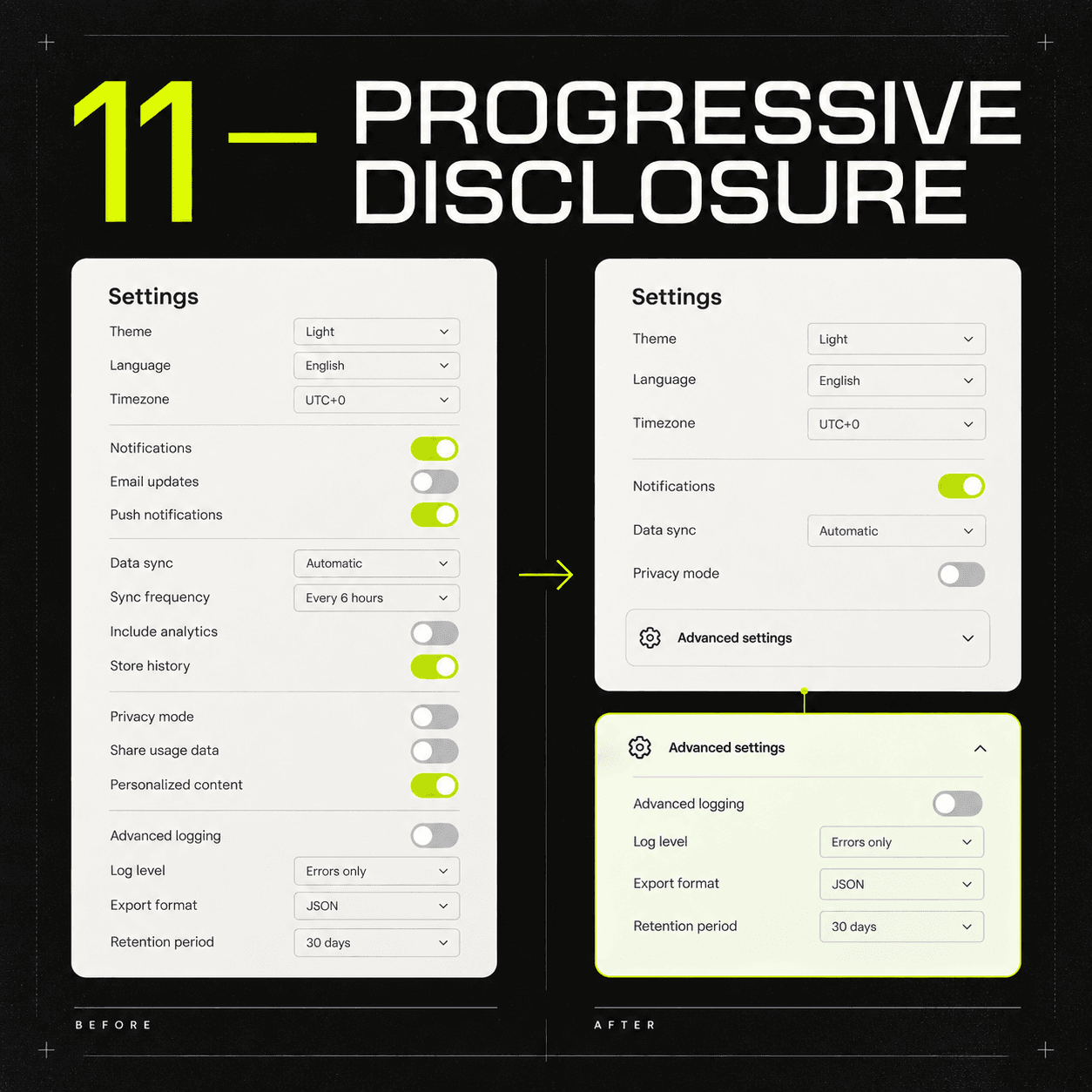
11. Progressive disclosure

Progressive disclosure shows the information most people need now and keeps deeper options available when they become relevant.

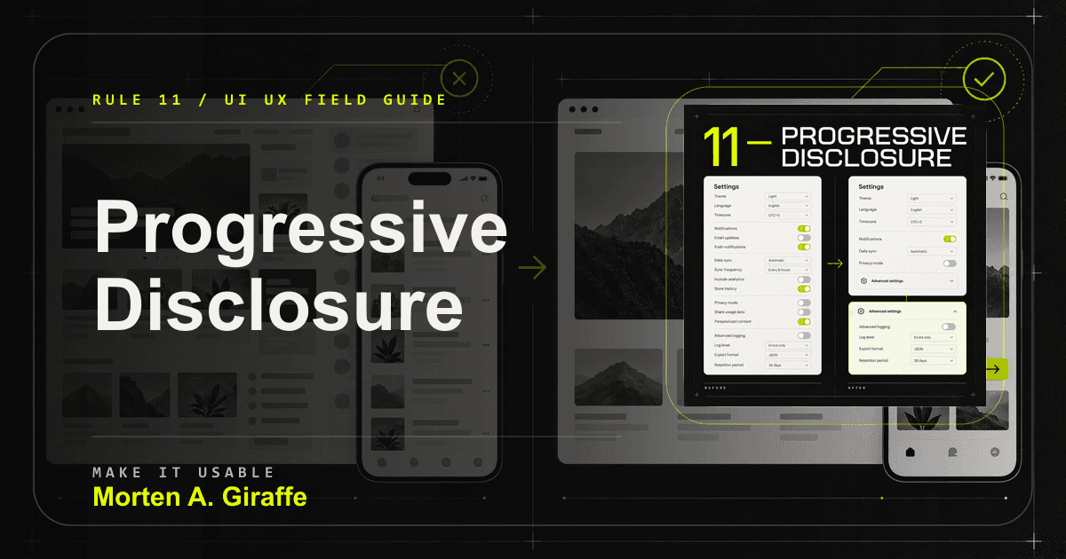
All settings exposed at once contrasted with core controls and an expandable advanced section.
Disclosure should reduce load, not hide inconvenient truth.

Why it matters

It protects beginners from unnecessary complexity without denying experts the controls they need.

Failure mode

Essential costs, consequences, requirements, or consent details are hidden behind vague "learn more" labels.

Applied correction

Hide only what is optional for the moment. The visitor should predict what an expansion contains, open it without losing context, and close it without losing work.

Practical test

Look at support questions and first-use behavior. If people cannot find advanced capability when they need it, the disclosure is too deep or poorly labeled.

Rule 12

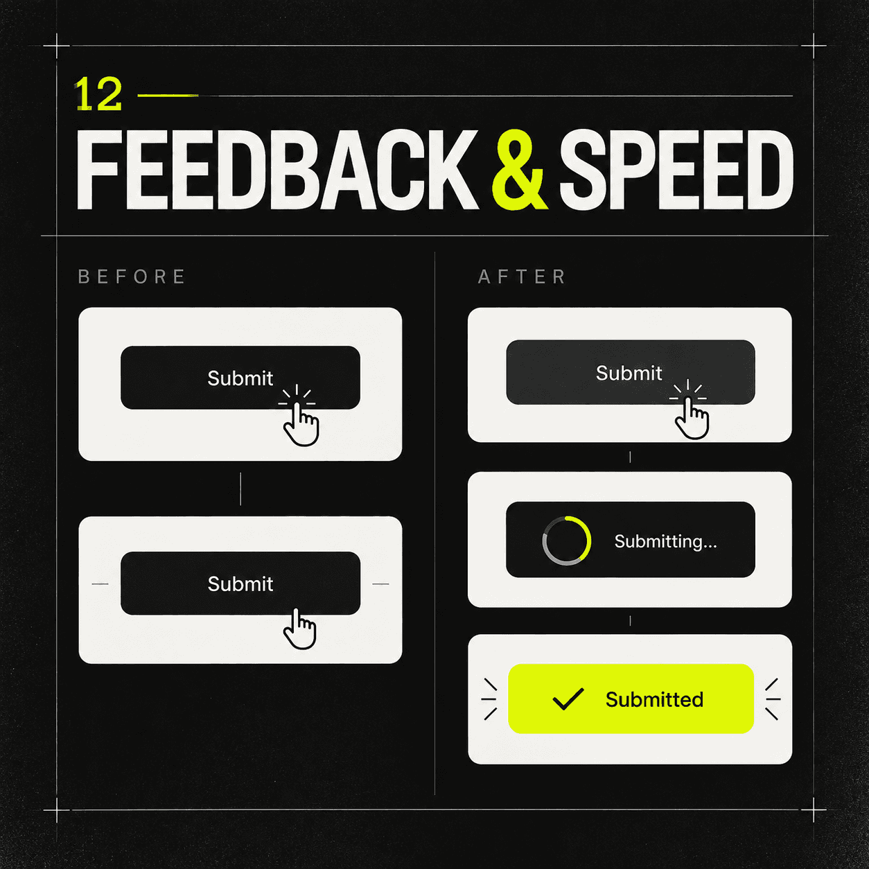
12. Feedback and speed

Every action needs an answer from the interface.

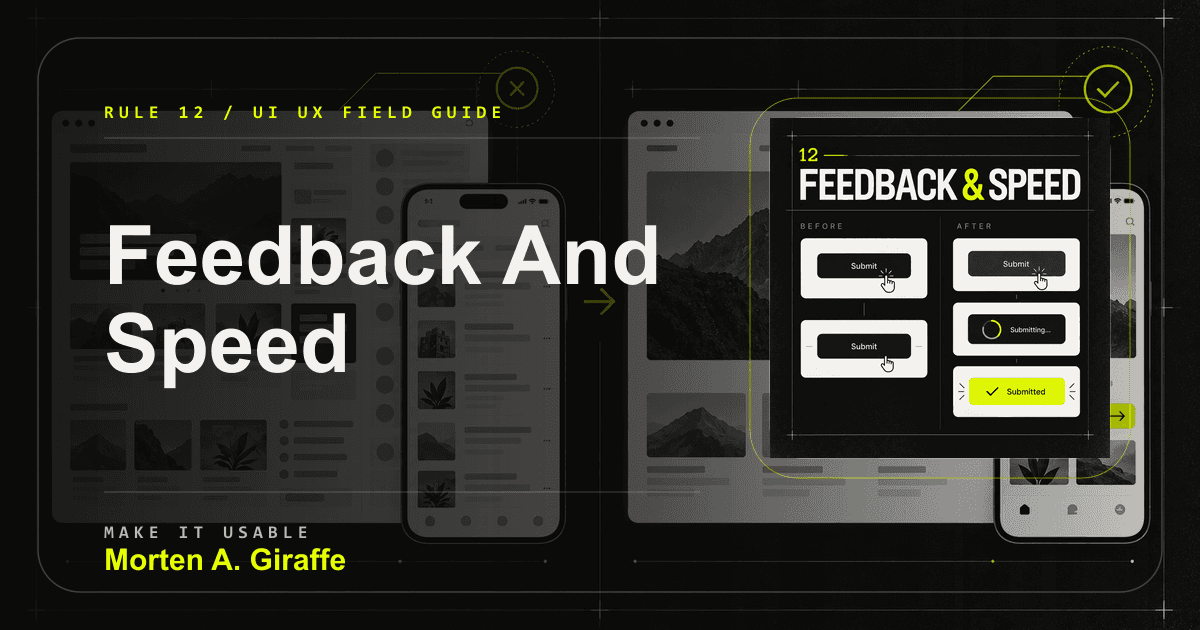
An unresponsive submit action contrasted with immediate progress and success feedback.
Speed is easier to trust when the system explains what it is doing.

Why it matters

Without feedback, people repeat clicks, abandon tasks, or wonder if they broke something. Perceived speed and technical speed both affect confidence.

Failure mode

A submit button does nothing for several seconds, a loading animation hides a stalled request, or success appears without explaining what happened next.

Applied correction

Define loading, empty, partial, offline, success, and failure states during design. Use optimistic updates only when reversal is safe.

Practical test

Throttle the network, double-submit the form, and watch whether the interface acknowledges input, prevents duplicate work, and announces the result.

Performance note: Core Web Vitals frame loading, interaction, and visual stability as measurable user experience signals.

Rule 13

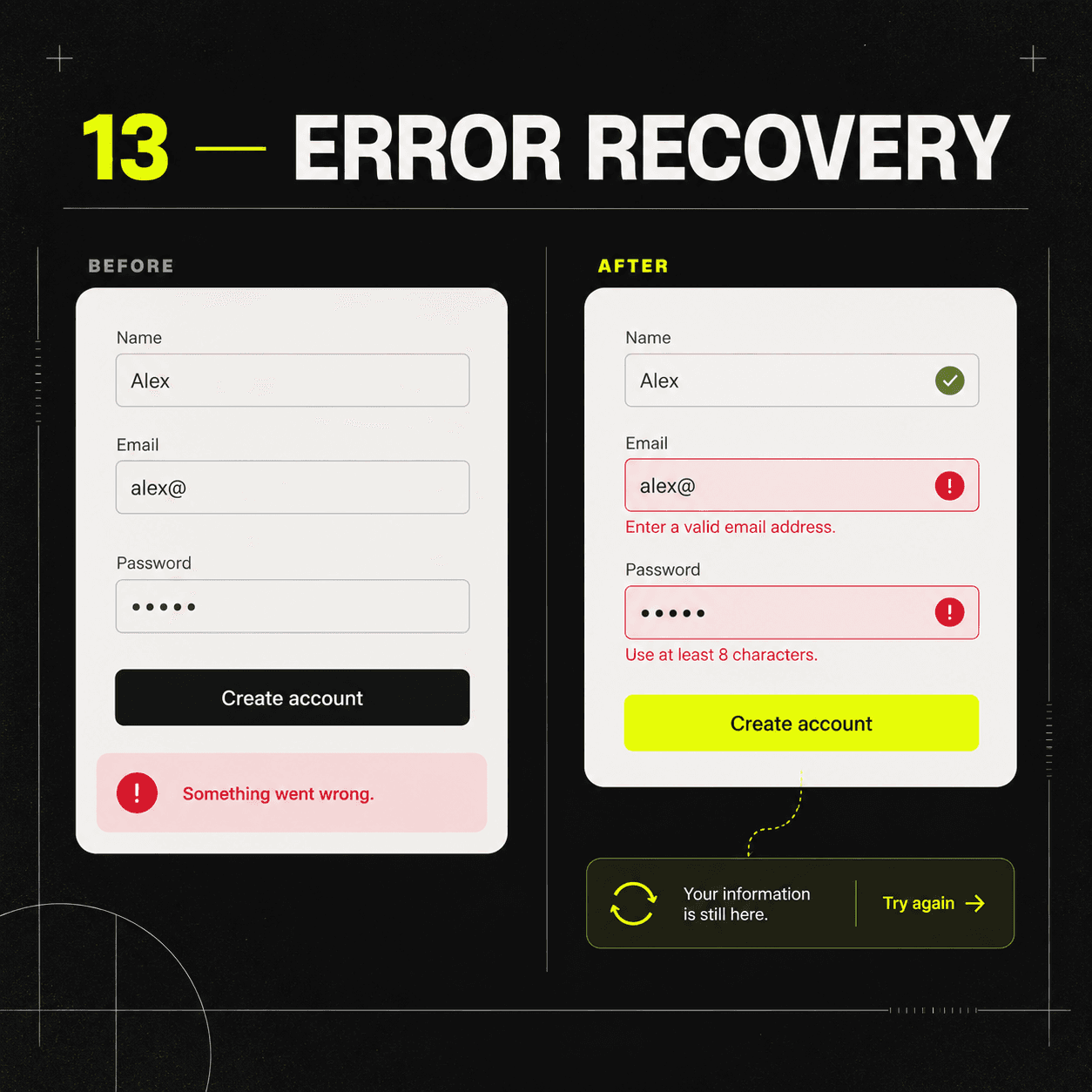
13. Error recovery

A good error state explains what happened, where it happened, what is still safe, and what to do next.

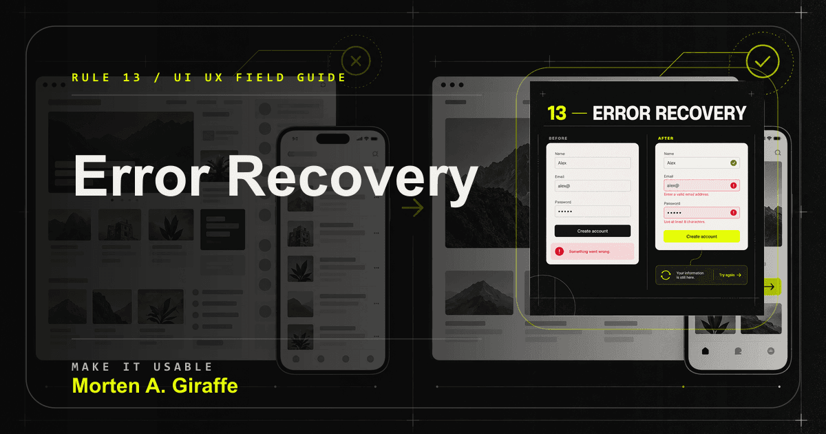
A vague form error contrasted with inline guidance preserved input and a clear retry path.
Recovery should make the next attempt easier than the first.

Why it matters

Real systems eventually fail. Recovery is part of the main experience, not a fallback page nobody designs.

Failure mode

The form resets valid input, exposes an internal code as the main explanation, or tells the person to try again without saying what failed.

Applied correction

Keep guidance local, preserve valid input, move focus to an error summary when useful, and make destructive confirmations match the consequence.

Practical test

Test expired sessions, invalid formats, duplicate submissions, interrupted uploads, server rejection, and retry.

Rule 14

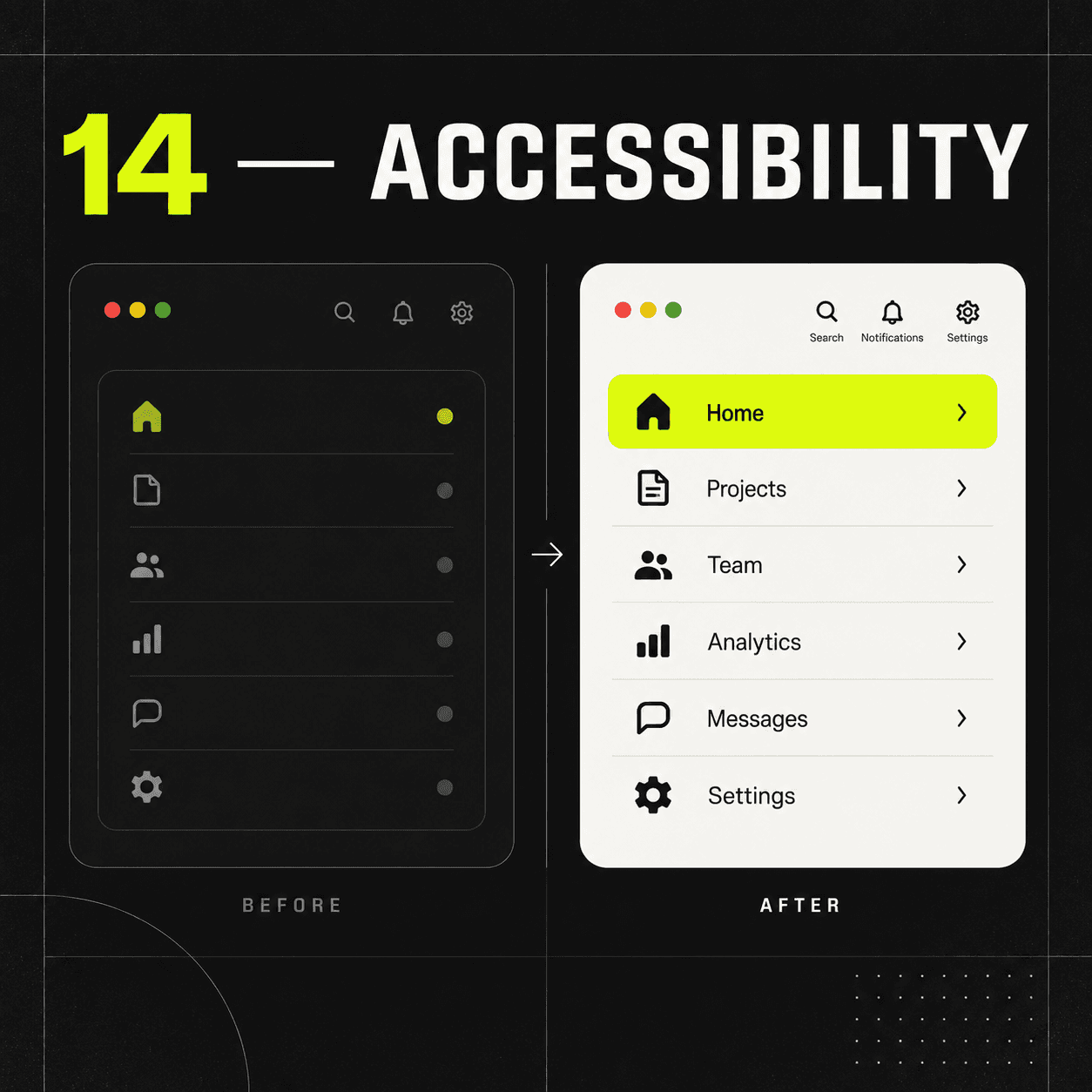
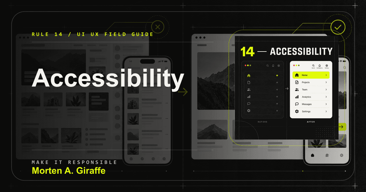
14. Accessibility

Accessibility proves the interface communicates through more than one fragile channel.

An interface relying on dim icons and color alone contrasted with readable labels and multiple cues.
Accessible structure is part of the design, not a compliance sticker.

Why it matters

Semantic structure, keyboard access, visible focus, useful alt text, labels, contrast, zoom support, and reduced-motion behavior make the design more robust for everyone.

Failure mode

Meaning depends on color alone, controls lack labels, focus disappears, or content breaks when text is resized.

Applied correction

Start with semantic HTML before ARIA. Use WCAG 2.2 as a baseline, then combine automated checks with keyboard, zoom, contrast, and screen-reader spot checks.

Practical test

Navigate by keyboard, zoom to 200 percent, check reflow, turn on reduced motion, and confirm images and controls still make sense.

Rule 15

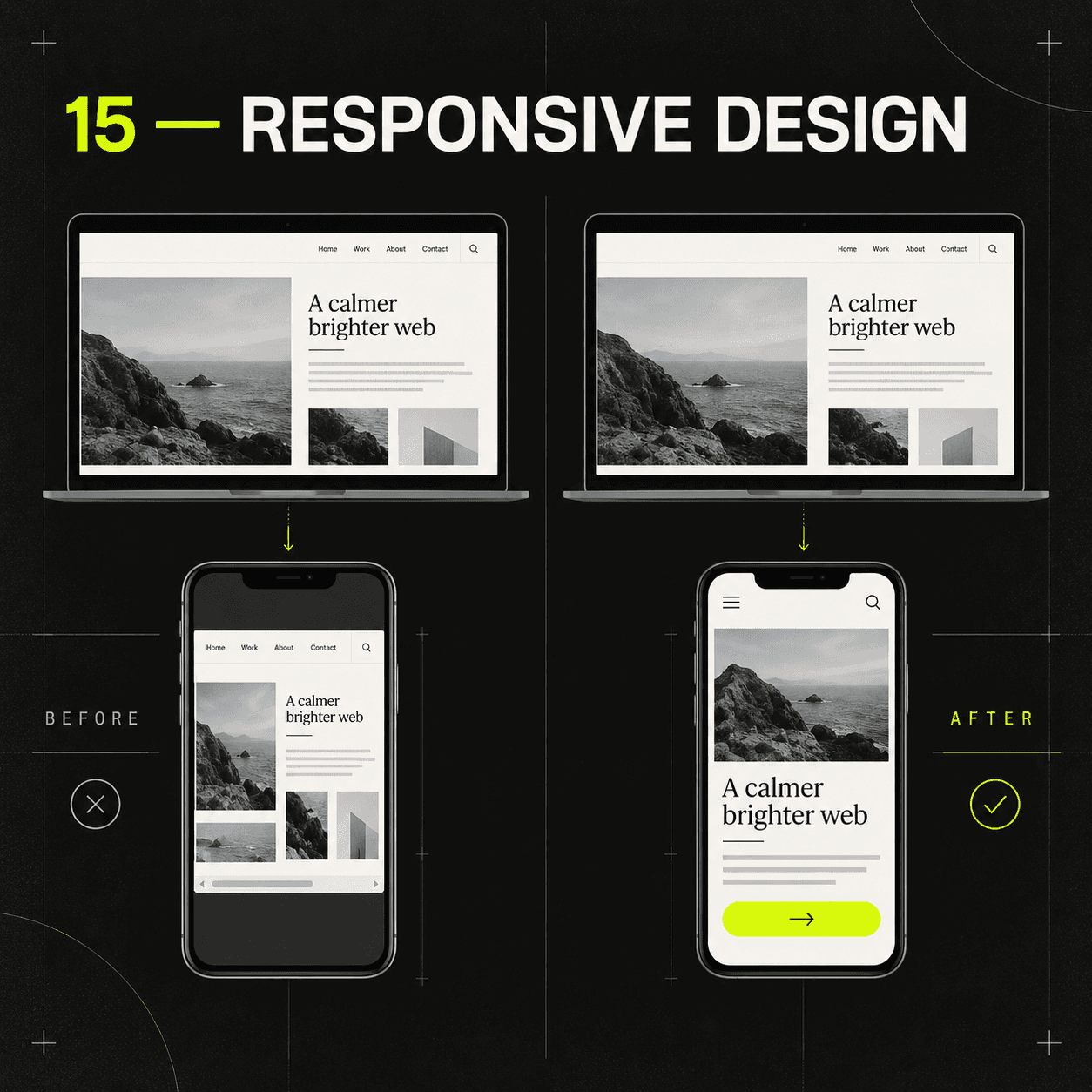
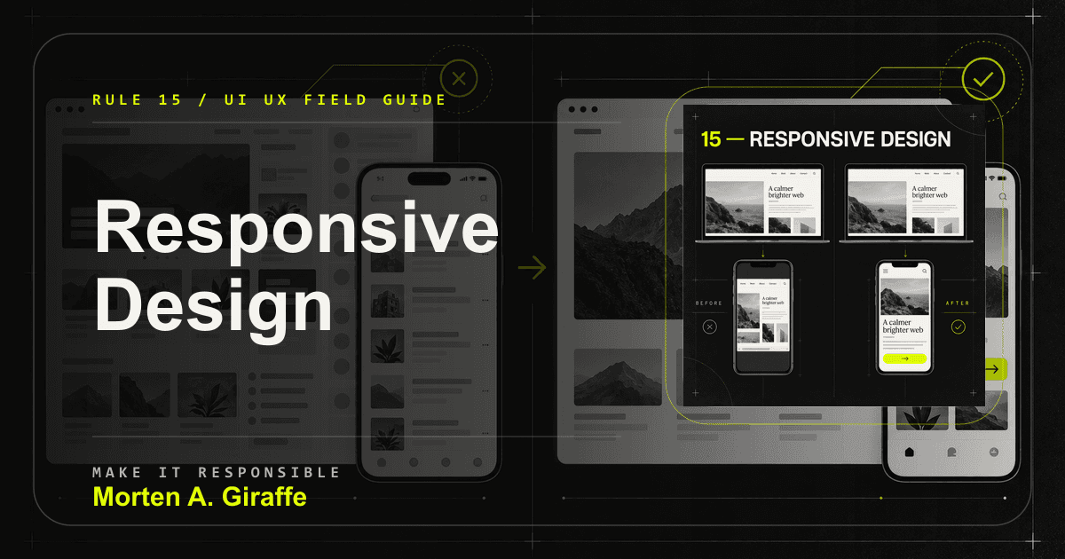
15. Responsive design

Responsive design is the same purpose expressed honestly under different screen and input constraints.

A desktop page squeezed into a phone contrasted with a purposefully reflowed mobile layout.
Responsive work is translation, not compression.

Why it matters

The mobile version is often the primary version. Columns can stack, but the reading order, decision order, and action path still need to make sense.

Failure mode

A desktop table becomes horizontal surrender on a phone, or a sticky action sits where the mobile keyboard and browser controls fight it.

Applied correction

Design from content and behavior, then choose breakpoints where the layout actually fails. Keep navigation understandable and persistent actions clear of unsafe areas.

Practical test

Check long names, landscape, zoom, slow connections, real touch input, and low-end device assumptions before calling mobile done.

Rule 16

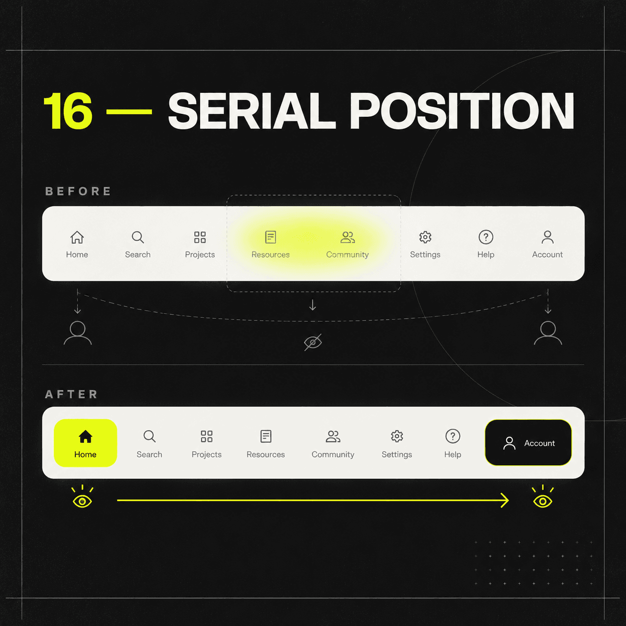
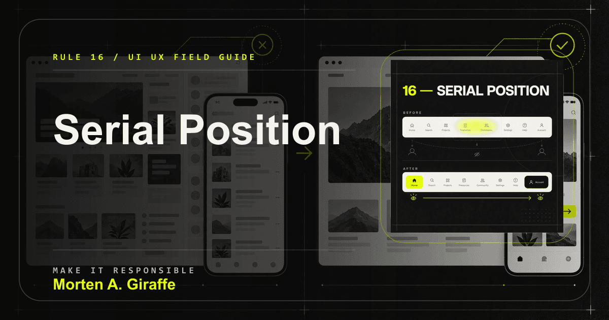
16. Serial position

People tend to remember the beginning and end of a sequence better than the middle.

Important navigation items lost in the middle contrasted with key actions at the beginning and end.
Use the beginning for orientation and the ending for resolution.

Why it matters

Interfaces can use this honestly by placing orientation early and a relevant next step where the section resolves.

Failure mode

The most important instruction is buried in the middle of a long paragraph or hidden among eight equal navigation items.

Applied correction

Open with the promise, use the middle for proof and objections, and close with the action or conclusion that matches the section.

Practical test

Ask what people remember after a short scan. Compare their answer with what the page needed them to understand.

Rule 17

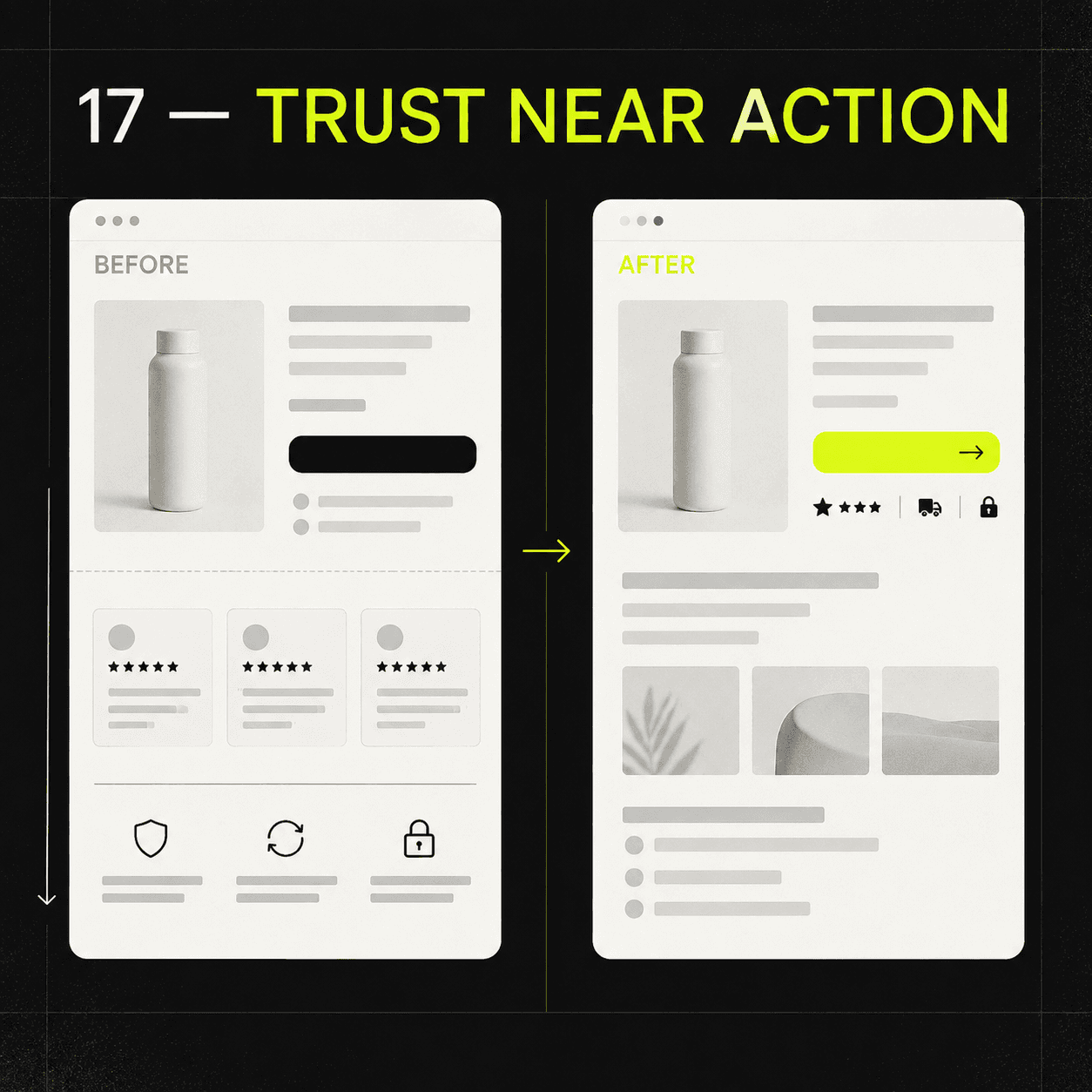
17. Trust near action

Trust is strongest when it appears beside the doubt it answers.

Proof located far from a purchase action contrasted with concise reassurance beside the decision.
Trust works better as an answer than as decoration.

Why it matters

Proof at the bottom of a page cannot answer a concern beside a price, form, calendar, or checkout action.

Failure mode

The site uses decorative trust badges, unsupported superlatives, fake urgency, or proof that sits far from the decision it is supposed to support.

Applied correction

Place relevant proof, terms, privacy reassurance, delivery expectations, and constraints near the action they support.

Practical test

For each primary action, name the doubt a serious visitor may have and check whether the answer is close enough to matter.

Rule 18

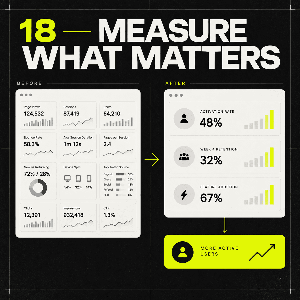
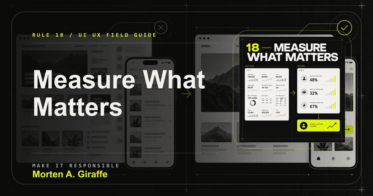
18. Measure what matters

A page succeeds when it improves the outcome it exists to support, not when it collects compliments or vanity clicks.

A dashboard of vanity metrics contrasted with a focused set of outcome measures.
The metric should answer whether the interface made the right work easier.

Why it matters

Analytics can show where something happened, but not always why. Useful measurement pairs behavior data with direct observation.

Failure mode

The team optimizes clicks on an irrelevant element, celebrates a shipped redesign, or changes the interface without a hypothesis.

Applied correction

Define the expected user benefit, the business outcome, and guardrail metrics before release. Watch for displacement when one number improves and another trust signal worsens.

Practical test

Tie measures to the job: qualified inquiry completion, checkout completion, task success, recovery rate, comprehension, activation, or retention.

04The Rule Behind The Rules

The interface should carry more of the burden.

It should not ask the visitor to decode the offer, memorize hidden context, hunt for the next action, guess whether a click worked, or recover from an error without help.

Good design often feels obvious after it is finished. That does not mean the work was obvious. It means the structure, language, behavior, visual system, accessibility, and performance agree on what the person needs next.

05FAQ

Useful answers, not schema bait.

What is the difference between UI and UX?
UI is the visible and interactive layer: typography, controls, color, spacing, layout, and states. UX is the broader experience of understanding, deciding, completing, and recovering across the journey.
Do UX laws always apply?
No. They are heuristics, not universal commands. Use them to reveal risk, then test against the audience, task, context, accessibility needs, and evidence.
Which rule should I fix first?
Start with purpose and task success. Then fix blockers involving access, comprehension, errors, trust, and the primary action before polishing low-impact details.
Can a website be beautiful and usable?
Yes. Beauty helps when visual choices reinforce the content and interaction. It hurts when it competes with the decision the visitor came to make.
How should these rules be tested?
Combine task-based usability review, keyboard checks, responsive review, performance measurement, analytics tied to outcomes, and direct qualitative feedback.

Project fit check

Bring the site that should work harder.

If this guide exposed problems in your own site, send the page, the offer, and the decision you need visitors to make. I will reply with the clearest next step.